
My Mobile-First Home Assistant Dashboard
This is the dashboard I actually open several times a day, not a showcase built once and left alone. The goal was always the same: answer "is everything fine?" in one glance, from a phone, without digging through menus to find out.
Start: the one screen that matters most
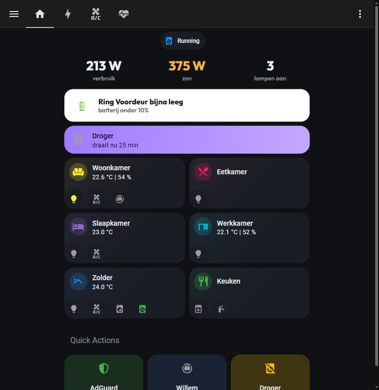
Three numbers sit at the top: live consumption, live solar production, and how many lights are on. That's usually enough to answer "is anything unusual happening right now" without opening another app.
Alert banners only show up when something needs attention (a low device battery, an appliance still running, an EV charging session in progress), and they disappear on their own once resolved. An empty space there is itself useful information; it means there's nothing to check.
Below that are room tiles, one per room, each showing only the controls relevant to that room: lights, aircon, appliance status. Tapping one opens a focused popup for that room instead of navigating to a whole separate page. At the bottom, a row of quick actions covers the handful of things I do often enough to want in one tap: nothing more than that.
Airco: every room's climate in one place
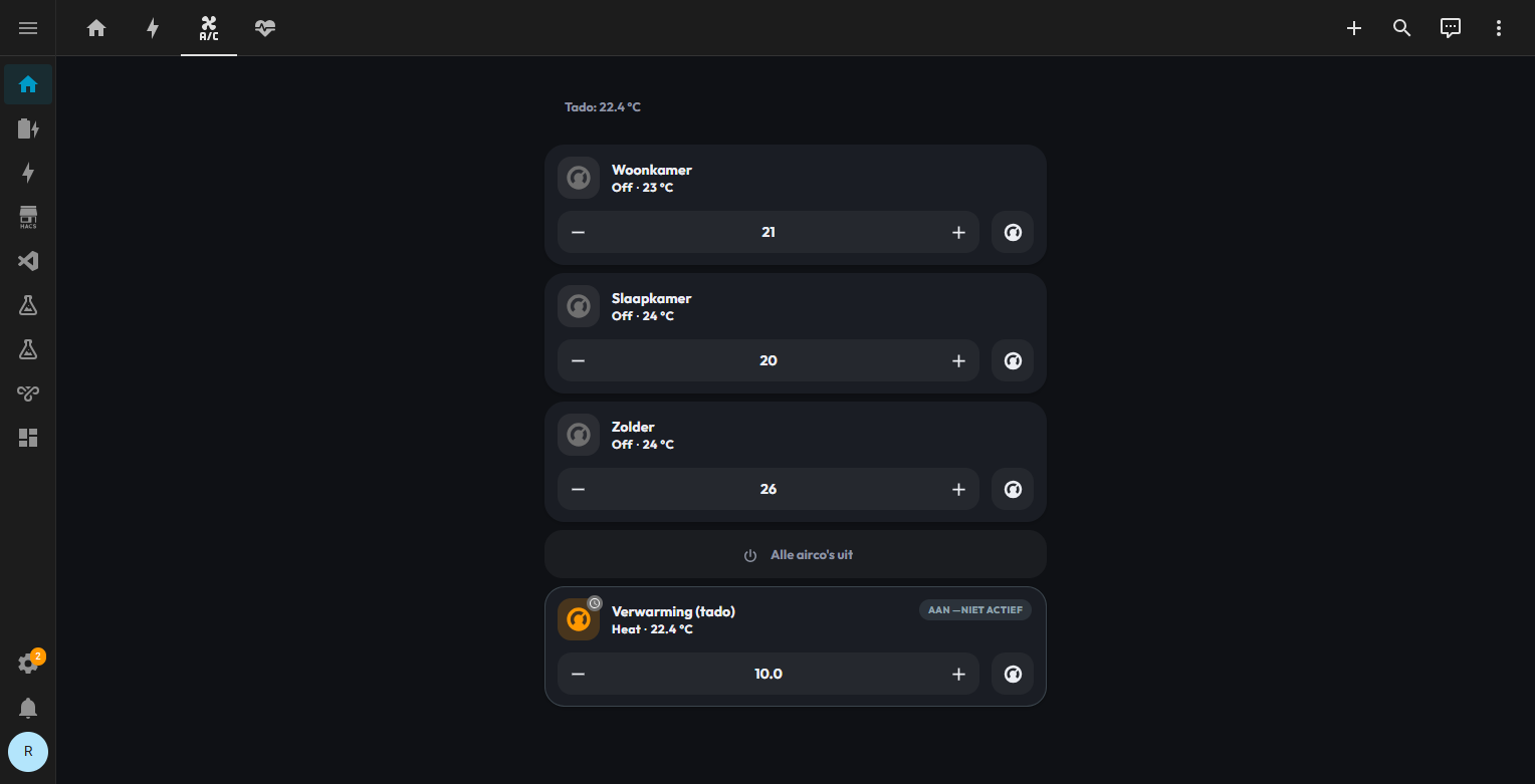
Room aircon controls exist inside the Start-tab popups too, but this tab pulls all of them into one screen for when I'm adjusting more than one at once: each room shows its current mode and temperature, with a stepper to change the setpoint and a shortcut into that unit's full controls. There's also an "all aircons off" button at a glance, and a separate card for the house's actual heating (a Tado thermostat), shown here in its idle state with the target temperature it'll kick in at.
Status: the tab that turns "probably fine" into an answer
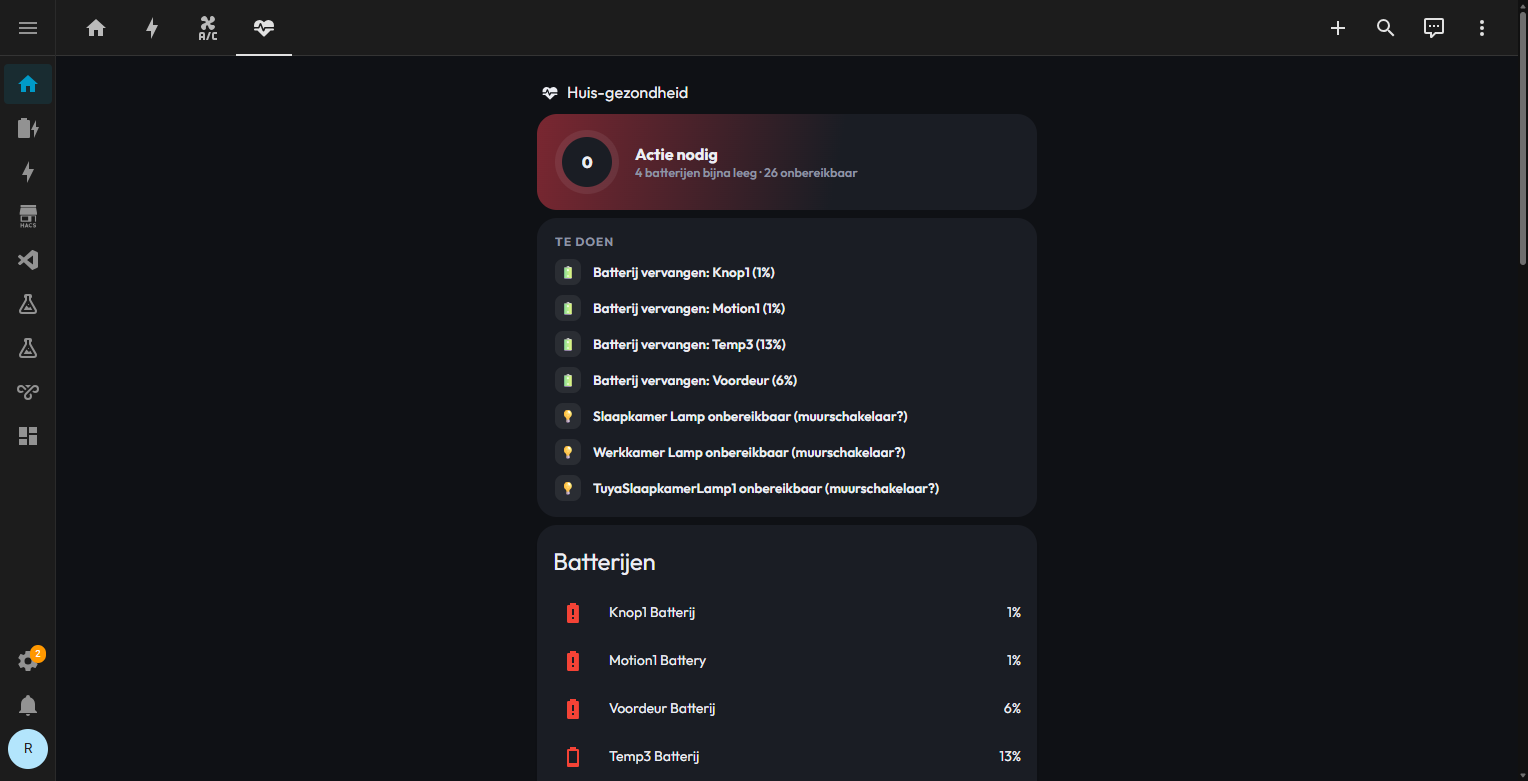
This is a house-health view, not a room view. A score up top says how many things currently need action; below it, a plain-language to-do list spells out exactly what: a battery to replace, a light reporting unreachable because its wall switch got flipped. Underneath that, every device under a battery threshold gets its own row with the actual percentage, so a "battery low" warning is never a mystery about which device it was.
Energie: what the numbers cost, not just what they are
The Energie tab breaks the Start tab's live consumption and solar figures down further: today/week/month/year toggles, a running cost-for-today figure, and (since there's an EV charger in the mix) a separate line for what charging cost versus what came back through ERE certificate revenue. I'm not publishing a screenshot of this one: it shows real cost and revenue numbers for the house, and those aren't something I want sitting in a public blog post indefinitely.
What it's built on
The stock Home Assistant tile/section editor isn't driving any of this: it's built almost entirely on HACS custom cards, edited directly as YAML rather than through the UI. Mushroom (mushroom-template-card, mushroom-chips-card, mushroom-title-card) handles the templated stat rows and chip-style status indicators. Bubble Card runs the per-room popups. button-card builds the room tiles themselves, templated per room instead of one card per entity. stack-in-card and card-mod handle layout and styling on top of all of that. None of it requires a paid add-on: everything above is free through HACS, Home Assistant's community integration and frontend-resource manager.
What it can actually do
Beyond just displaying state, a handful of things are one tap away directly from the dashboard: toggling a room's lights, jumping into aircon control for that room, running specific vacuum zones, pausing the DNS ad-blocker for an hour, cutting power to the dryer outlet. The last three each sit behind a confirmation dialog, since those are the ones I don't want triggered by an accidental tap.
What I'd do differently
The biggest win wasn't any individual card: it was deciding early that alert banners only render when there's actually something to say, and disappear the moment it's resolved. A dashboard that always shows "everything is fine" is just noise; one that stays quiet by default and only speaks up when something's actually wrong is the one worth glancing at. I'd apply that rule to every tab from day one if I started over, instead of retrofitting it onto Start after noticing how much better it worked there.
Related
Home Battery Simulator
Six parallel Home Assistant battery simulations against real smart-meter data: seeing money saved per capacity before buying any hardware.
AI-Built Dashboards
How an AI assistant edits my Home Assistant config over YAML (file-first, not the UI) and three real failures that taught me to check its work.
Joulo API: ERE Earnings
Got an MID-certified EV charger in Joulo's ERE scheme? Here's the API, the fields that actually matter, and how to pull them into Home Assistant.
If this saved you some time, a coffee keeps the lights on and the posts coming.
☕ Buy me a coffee